What Is a Dark Pattern? A Practical Guide
You have probably experienced a dark pattern without knowing what to call it. You tried to cancel a subscription and got routed through five pages of "Are you sure?" prompts. You booked a flight and found travel insurance added to your cart automatically. You signed up for a free trial and discovered three months later that your credit card had been charged because the cancellation button was nearly impossible to find.
These are not accidents. They are deliberate design decisions. And they have a name.
Defining Dark Patterns
The term "dark pattern" was coined by UX researcher Harry Brignull in 2010. It refers to user interface designs that deliberately manipulate people into making choices they would not otherwise make. Unlike a confusing interface caused by bad design, dark patterns are confusing on purpose. The confusion is the feature.
A more precise definition: a dark pattern is any design element that benefits the business at the expense of the user by exploiting cognitive biases, creating false urgency, hiding information, or making the undesired action disproportionately difficult compared to the desired one.
The key distinction is intent. A poorly designed checkout page might accidentally confuse users. A dark pattern checkout page confuses users because confusion increases revenue. The result for the user might look similar, but the underlying incentive structure is fundamentally different.
Common Types of Dark Patterns
Dark patterns come in many forms, but most fall into a handful of recognizable categories.
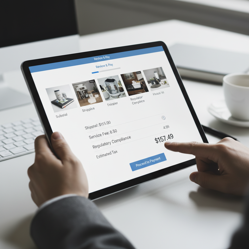
Sneak into basket. Items or services are added to your purchase without your explicit request. Travel insurance on airline bookings, extended warranties on electronics, premium upgrades on software subscriptions. The addition happens quietly, and the user must actively remove it. The default is spending more money.
Roach motel. Getting into something is easy. Getting out is deliberately hard. Signing up for a subscription takes two clicks. Canceling requires a phone call during business hours to a line with a 45-minute wait. The asymmetry is the manipulation.
Confirmshaming. The option to decline is worded to make you feel bad. "No thanks, I don't want to save money." "I'll pass on protecting my family." The decline button is not neutral. It is designed to trigger guilt or self-doubt.
Forced continuity. A free trial seamlessly converts to a paid subscription with no clear notification. The trial sign-up is prominent. The conversion notice is buried in an email that looks like every other automated message. The business counts on inertia and inattention.
Hidden costs. The price you see is not the price you pay. Fees, surcharges, and mandatory add-ons appear late in the checkout process, after you have invested time and mental energy. By then, most people just accept the higher total rather than start over.
Misdirection. Visual design is used to draw attention toward the option the business wants and away from the option the user probably wants. The "Accept All Cookies" button is large and colorful. The "Manage Preferences" link is small, gray, and buried in a corner.
Trick questions. Confusing language or double negatives make it unclear what the user is agreeing to. "Uncheck this box if you would prefer not to not receive marketing communications." By the time you parse the sentence, you have already moved on, which is the point.
Dark Patterns in Service Businesses
Dark patterns are not limited to e-commerce and big tech. They have found their way into the software that local service businesses use to interact with customers.
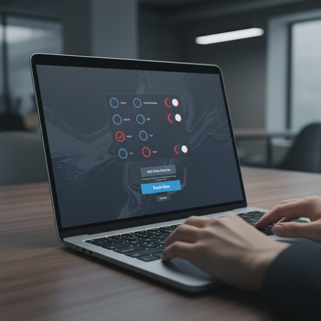
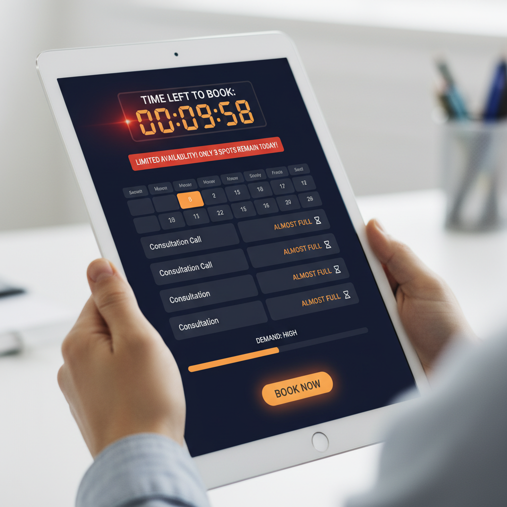
Online booking systems use soft pressure tactics to push customers toward more expensive appointments or unnecessary add-on services. Digital vehicle inspections can present findings in ways that manufacture urgency around repairs that are not immediately needed. Review collection tools use gating mechanisms to filter out negative feedback before it reaches public platforms.
In many cases, the shop owner using these tools does not realize the software includes dark patterns. The vendor designed the interface, set the defaults, and wrote the copy. The shop owner just turned it on. But from the customer's perspective, the dark pattern comes from the business, not the software vendor. Understanding what your tools are doing matters.
Why Dark Patterns Work
Dark patterns exploit well-documented cognitive biases. Loss aversion makes people reluctant to remove something already in their cart. Status quo bias makes the default option disproportionately powerful. Social proof (real or fabricated) triggers herd behavior. Scarcity signals bypass rational evaluation.
These are not weaknesses unique to careless or unintelligent people. They are fundamental features of human cognition that affect virtually everyone. Dark patterns work because they are designed by people who understand psychology and are willing to use that understanding against the very users they are supposedly serving.
This is what makes dark patterns ethically distinct from other persuasion techniques. Advertising persuades. Good design guides. Dark patterns deceive. The user is not making an informed choice. They are being manipulated into an action that benefits someone else.
The Legal Landscape
Regulators are catching up. The Federal Trade Commission has taken action against companies using dark patterns, particularly around subscription cancellation and data consent. California's CPRA explicitly prohibits dark patterns in the context of consumer privacy choices. The EU's Digital Services Act includes provisions targeting manipulative design.
But enforcement is inconsistent, and the legal definition of "dark pattern" is still evolving. Many practices that most reasonable people would call manipulative remain technically legal. Regulation is a floor, not a ceiling. Staying above the floor is not the same as acting ethically.
How to Spot Dark Patterns
You do not need a UX degree to recognize dark patterns. A few questions will catch most of them:
Is the action I want harder than the action they want? If declining is more difficult than accepting, something is off. Ethical design makes both options equally accessible.
Was something added without my asking? Check your cart, your subscription, your settings. If anything is there that you did not explicitly choose, you have encountered a dark pattern.
Am I being rushed? Countdown timers, limited availability warnings, "only 2 left" messages. These urgency signals may be genuine, but in many cases they are fabricated to pressure you into a quick decision.
Is the language confusing? If you cannot immediately tell what you are agreeing to or declining, the confusion is probably serving someone's interests. It is just not yours.
Building the Alternative
The opposite of a dark pattern is not a boring interface. It is an honest one. Businesses that reject dark patterns can still build compelling, effective user experiences. They just do it by providing genuine value and clear information rather than by exploiting cognitive shortcuts.
For service businesses, this means choosing software that treats customers as informed adults. It means auditing automated workflows for manipulative elements. It means recognizing that a conversion driven by a dark pattern is not a win. It is a trust deficit that will eventually come due.
The concept of meaningful consent is central here. Every interaction with a customer is an opportunity to either build trust or erode it. Dark patterns erode it. Honest design builds it. The technology enables both. The choice belongs to the business.
Understanding what dark patterns are is the first step toward eliminating them. Whether you are a consumer trying to navigate an increasingly manipulative digital landscape or a business owner who wants to do better than the industry default, awareness is where it starts. The patterns are everywhere. Once you learn to see them, you cannot unsee them.